AIGA
Creative Space Branding
Background
AIGA Creative Space is a collaborative and evolving curriculum that teaches high school students design thinking. Working closely with faculty at Round Rock Independent School District and AIGA Members, we prototyped a learning system with the graphic design intensive student group at RRHS. We also developed branding and collateral that would speak to this specific age group. Our ultimate goal is to design a teaching method that can be used across a wide range of learning environments, with a focus on underserved communities. In keeping with our core mission, we hope to uplift and enrich both our community and the standard of design practice by introducing socio-economic groups that have traditionally not had access to design learning into the creative fold.

Web + Social Plan
Because of the age group we knew it was critical not only to have an easy to navigate website but to also have social media presence. We built the site mobile first, knowing that most of our students were accessing the internet using their phones. The single page site gave them information for themselves, their parents and their teachers as well as quick access to signing up and contacting us. Our social media plan leveraged the same materials we posted throughout the schools so that there was both consistent messaging and recognition. Using hashtags and location tagging was helpful in connecting to the students interested and to also discover what parts of the program were interesting (or not) to them.

The Mark
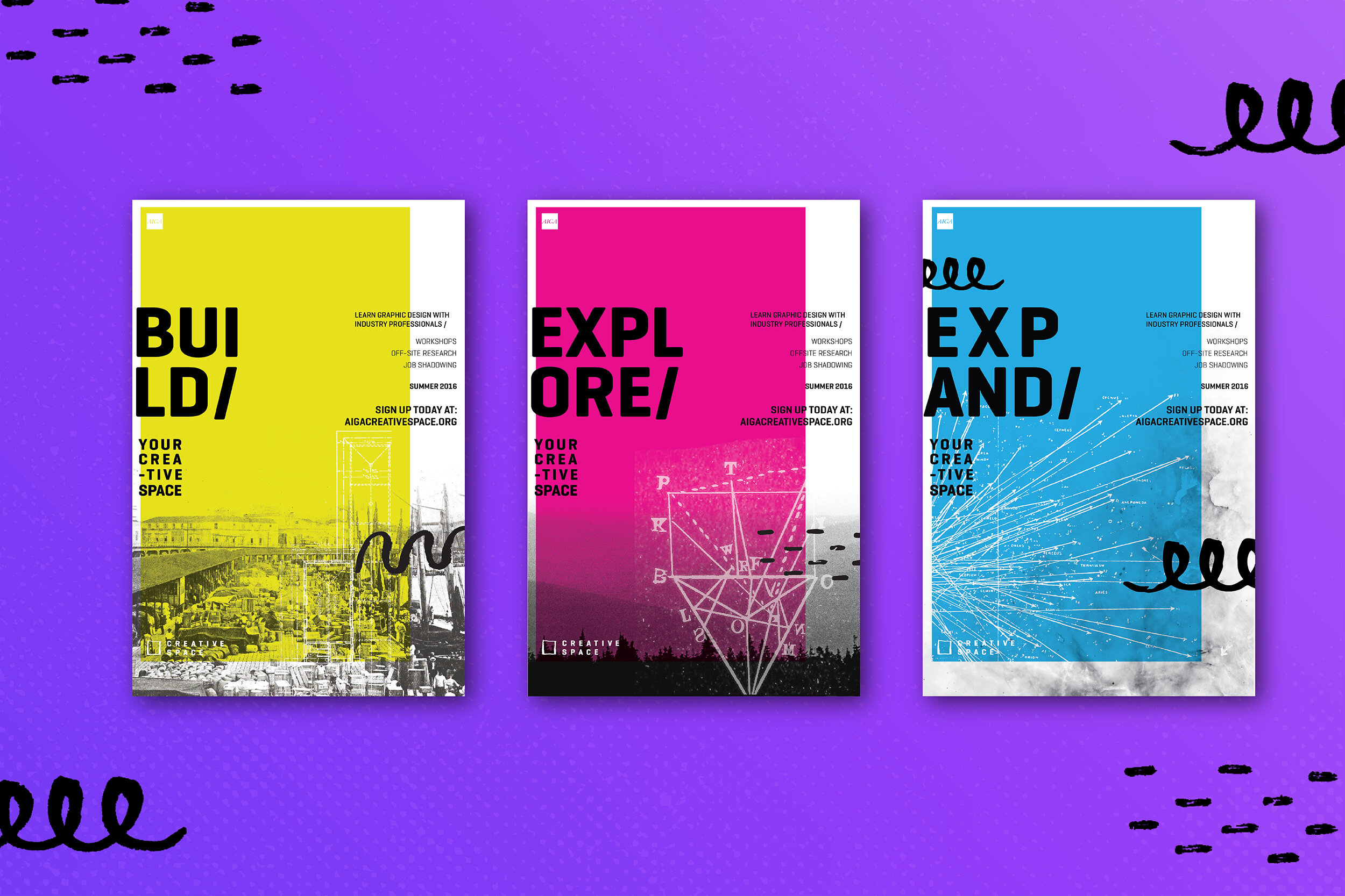
I wanted to create a mark that would be simple enough to not only sit with the loud, playful and sometimes chaotic posters and brand artifacts, but something that could also function as a creative asset to the brand. Through a lot of iteration and sketching we ultimately ended up back at some of our initial doodles, where we were the most playful. The simple box created not only a blank canvas but it also represented an opportunity and a literal space. With the mark we were able to make it as inconspicuous or as prominent as we wanted, depending on how it was used. It also gave us a lot of fun opportunities for collateral.
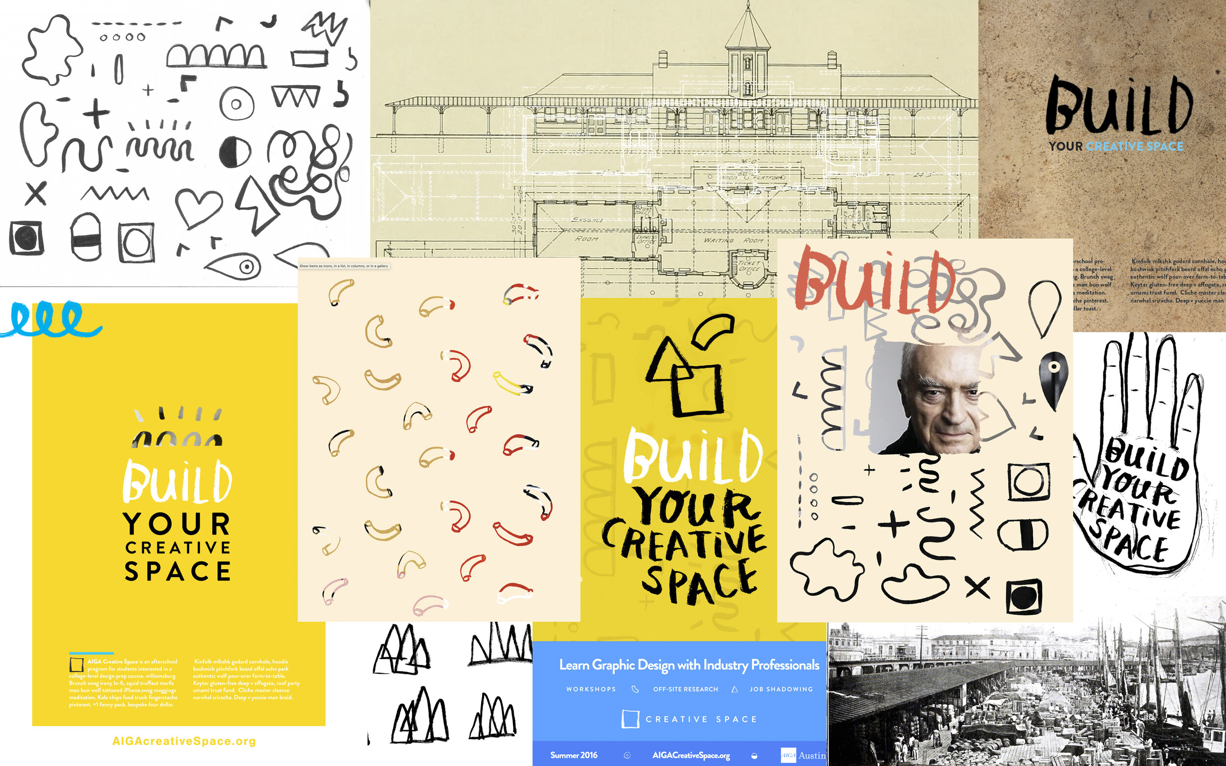
Process + Concept
I started by researching and writing to develop an overall brand tone and then shifted to create mood boards to capture all of the visual research I had done and turned that into something visual. Using the elements from the mood boards and all of my writing, I began creating stylescapes by collaging various elements and words together to build the concept. I further refined my concepts by rebuilding the stylescapes with original elements and phrases I created and wrote. Once those were defined I used those pieces as my north star, defining the creative direction for the brand and the art direction for the collateral.